Ever stood in an art supply store, overwhelmed by walls of paint tubes, wondering why “Ultramarine” from one brand looks nothing like another’s? Or why that gorgeous purple you bought turned muddy brown when mixed with yellow? Welcome to the fascinating world of pigments — the actual chemistry that makes your art possible.
Understanding pigments isn’t about becoming a chemist. It’s about making informed choices that save you money, time, and frustration while elevating your work to professional standards. Let’s decode the secret language on those paint tubes and build you a palette that actually works.
The Pigment Code: Your New Superpower
Those cryptic letters and numbers on paint tubes? They’re Color Index codes — the universal language of pigments that cuts through marketing fluff. Once you understand them, you’ll never be fooled by fancy names again.
Here’s your decoder ring: PY = Pigment Yellow, PR = Pigment Red, PB = Pigment Blue, PG = Pigment Green, PV = Pigment Violet, PBr = Pigment Brown, PBk = Pigment Black, PW = Pigment White. The numbers? They identify the exact chemical compound.
So when you see PB60, you know it’s Anthraquinone Blue (or was it Indanthrene Blue? No, wait… Indanthrone Blue?) — whether the tube says “Night Blue”, “Bluish Gray”, or “Royal Blue” (that one is defo Indanthrone!) Same pigment, same behavior, just different marketing. Single-pigment colors (one code) mix cleaner than multi-pigment blends. That “convenience green” with five pigment codes? It’ll turn to mud faster than you can say “happy little trees.”
Essential Properties That Actually Matter
Transparency vs. Opacity — This isn’t just technical jargon; it’s the difference between luminous glazes and muddy overworking. Transparent pigments (like Quinacridones and Phthalos) let light bounce off your paper and back through the paint — that’s where the magic glow comes from. Opaque pigments (Cadmiums, Yellow Ochre) sit on top, perfect for corrections but deadly to luminosity if overused.
Lightfastness — Nothing’s worse than watching your masterpiece fade. Look for ASTM ratings I (AA or E for excellent) or II (A or VG for very good) — these are permanent. Anything rated III or below? Save it for your sketchbook and scanner-only work. The romantic notion of fugitive pigments might sound artistic, but your collectors won’t appreciate disappearing artwork.
Staining vs. Non-staining — Staining pigments (Phthalos, most Quinacridones) grab your paper and won’t let go. Great for intense color, terrible if you like to lift and rework. Non-staining pigments (most earth colors, heavy metals, genuine Ultramarine) play nicely — they’ll lift back to almost white paper if needed.
Granulation — Some pigments naturally separate and create gorgeous texture as they dry. Ultramarine, Raw Umber, and some earth pigments do this beautifully. Others stay smooth. Neither is better — it’s about knowing what you’re getting.
Your Professional Starter Palette: The Essential Twelve
Forget those 80-color wooden boxes for now. You’ll treat yourself someday, I promise. Here’s a curated palette that can mix virtually any color you need, based on solid pigment science:
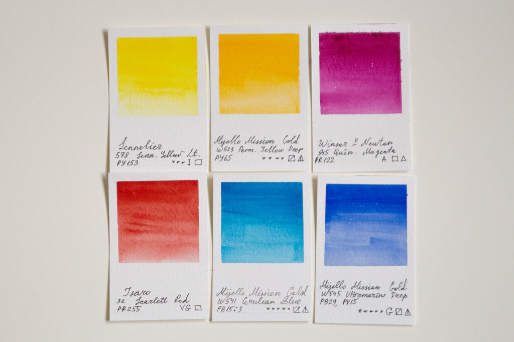
The Six Primaries:
- Lemon Yellow or Yellow Light (PY184, PY153 or PY175) — Cool, transparent, perfect for mixing vibrant greens.
- Yellow Deep (often called Indian Yellow, with PY83 or PY110) — Warm, saffron yellow, creates rich oranges.
- Quinacridone Rose (PR202, PR122 or PV19) — Cool pink-red, transparent, mixes gorgeous purples with Phthalo Blue.
- Permanent Red (my first choice would be Pyrrole PR254 or warmer PR255 Rose Dore / Scarlet variety) — Ferrari red for vibrant oranges and corals.
- Phthalo Blue Green Shade (PB15:3) — Cool blue, transparent, electric mixing power; it’s sometimes called Cerulean, although real Cerulean is a separate cobalt pigment PB35, usually granulating and less staining.
- Ultramarine Blue (PB29) — Warm blue, somewhat granulating, classic for shadows and natural green mixing.
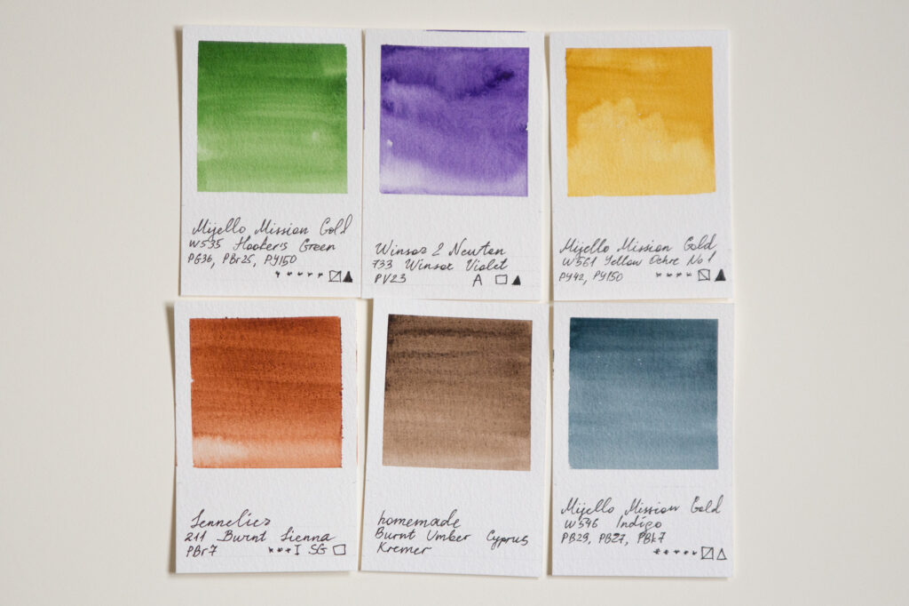
The Six Conveniences:
- Sap Green (varies by brand) — Your landscape workhorse. You could replace it with darker Hooker’s Green (Roman Szmal has one that’s closest to the original Hooker’s mix, meaning Prussian PB27 with Gamboge PY150). Or try Green Gold (PY129 Irgazine) — this transparent yellow-green is simply a mixing magician.
- Dioxazine Violet (PV23) — Rich purple, powerful tinting strength.
- Yellow Ochre (PY42/43) — Earthy, opaque, tones everything down naturally. Some brands (Schmincke, Roman Szmal, Michael Harding and others) offer transparent ochres, too. At a time of writing this article, my only Ochre is Mijello’s No 1, with Nickel Azo Yellow added for staining power.
- Burnt Sienna (PBr7) — Transparent earth orange, perfect for skin tones and autumn, as well as wonderful grays when mixed with blue (easy to remember if you’ve ever neutralized orange brassiness with blue shampoo!)
- Van Dyke Brown or Burnt Umber (PBr7) — Your neutral mixing champion. Brands like Daniel Smith and Rublev are a treasure trove for earth colors!
- Indigo Hue or Payne’s Gray (varies) — Moody blue-gray for instant atmosphere. Original Payne’s mix is Prussian PB27 + Yellow Ochre PY43 + Crimson Lake (PR254 or PR264). Genuine Indigo is fugitive, hence many modern mixes for Indigo are done by mixing blue and magenta into black. If you’re into granulation and abstract landscapes, Schmincke has “Haze Indigo” done on Ultramarine, Cobalt Chromite Green and Zinc Iron Chromite Brown.
□ – transparent | ⧅ – semi-transparent | ■ – opaque | ◩ – semi-opaque | ▲ – staining | △ – non-staining
G – granulating | SG – slightly granulating
AA / I / E / ***** / *** – excellent lightfastness | A / II / VG / **** – very good lightfastness
Smart Shopping: Research Before You Buy
Here’s where artistpigments.org becomes your secret weapon. Enter any color in their search, then filter by the properties you want — transparency, lightfastness, staining power. It’s like having x-ray vision for paint shopping.
Start with transparent and semi-transparent paints for your core palette. They’re versatile, mix beautifully, and maintain luminosity. Add opaque colors strategically — they’re fantastic for highlights and corrections but can quickly deaden mixtures. Those granulating textures and shimmery iridescents? Save them for when you’ve mastered your basics — they’re the spices, not the main ingredients.
Don’t trust online swatches alone. YouTube is goldmine for real pigment comparisons. Search “[pigment code] comparison” and watch how different brands interpret the same pigment. Indigo, for instance, varies wildly — some brands use actual Indigo (PB66), others create hues from multiple pigments. Both can be beautiful, but they behave differently.
Invest in professional quality from the start. Good brands that balance quality with value include Winsor & Newton Professional, Sennelier’s honey-based line (gorgeous flow), Mijello Mission Gold (exceptional price-to-quality ratio), Schmincke Horadam (European excellence), Daniel Smith (huge color range), and MaimeriBlue. Yes, they cost more than student grade, but the pigment load is higher, colors are more vibrant, and they actually save money long-term — you use less paint for the same intensity.
The Dark History in Your Paint Box
Today’s safety standards mean you’re unlikely to accidentally poison yourself with your paints, but pigment history reads like a gothic novel. Lead White, the master’s secret to luminous skin tones? Also known as “the painter’s disease” for causing lead poisoning. Cinnabar Vermilion contained mercury. Emerald Green had arsenic. Radium Green literally glowed — because it was radioactive.
These historical troublemakers are now restricted to restoration experts who need exact matches for conservation work. Modern chemistry has given us safer alternatives, though some artists mourn the loss of certain qualities — nothing quite matches the density of genuine Lead White or the brilliance of true Vermilion. Still, keeping your nervous system intact seems worth the trade-off.
Heavy metals like Cadmium and Cobalt are still used but with proper handling, they’re safe. Many manufacturers now offer excellent “hue” versions — cadmium-free alternatives that come remarkably close to the originals, though they might lack specific characteristics like opacity or granulation. The choice is yours, but knowledge is power.
Beyond the Basics
Once you’ve mastered your core palette, the pigment world opens up. Transparent iron oxides create glowing earth tones. Interference pigments shift colors depending on viewing angle. Definitely purchase Nickel Azo Yellow PY150 and start collecting all Quinacridones. Ever wondered about those glorious hues on maple trees in autumn sun? You can’t paint them without a good stash of Quinacridones! (Coral, Burnt Scarlet, etc).
And then there are the mineral pigments — excuse me, minerals, Marie! (Your inner Hank Schrader will appreciate the distinction.) Daniel Smith’s PrimaTek line and similar mineral series from other brands take genuine semiprecious stones — Amethyst, Hematite, Serpentine, Tiger’s Eye — and grind them into paint. Yes, you’re literally painting with rocks… sorry, minerals. These create textures and granulation patterns impossible to replicate with synthetic pigments. Jadeite Genuine settles into paper crevices like ancient river sediment. Bloodstone Genuine separates into deep greens with blood-red speckles that no amount of color mixing could achieve. They’re expensive, quirky, and completely unnecessary for most work — which is exactly why they’re irresistible. Natural mineral pigments like genuine Lapis Lazuli or Malachite connect you to centuries of art history. Once you start collecting them, you’ll find yourself at gem shows evaluating rough stones not for jewelry but for how they’d look ground up and mixed with gum arabic. It’s a slippery slope from ‘I just need basic colors’ to ‘but imagine how Labradorite would granulate!”
Understanding pigments transforms paint shopping from overwhelming to empowering. You’ll walk into art stores knowing exactly what you need, immune to marketing hype. You’ll predict how colors will mix before your brush hits paper. Most importantly, you’ll choose materials that serve your artistic vision rather than fighting against it.
Start with the suggested twelve colors. Learn their personalities — how they flow, mix, and dry. Use artistpigments.org to research alternatives when you’re ready to expand. Watch comparison videos. Build your palette thoughtfully, one tube at a time. Your art deserves more than random color choices. Give it the foundation of solid pigment knowledge, and watch your work elevate from amateur to professional. Those mysterious codes on paint tubes? They’re not obstacles — they’re your roadmap to mastery.